16 — Sunburst
Hierarchy in rings#
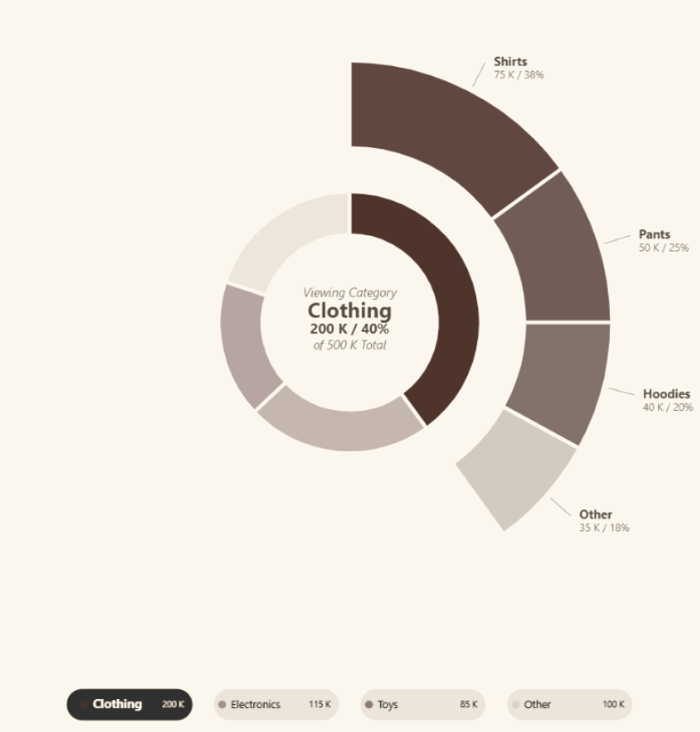
Two levels of hierarchy radiate from a central total: parents on the inner ring, their children on the outer. The ring geometry is dynamic, so the chart absorbs a changing number of categories.
The idea
Deneb visuals for Power BI, built to be reused, studied and adapted.
Every template arrives fully formatted: Power BI theme integration, configurable parameters, and inline documentation throughout.
Import, bind your fields, and start from a strong foundation rather than a blank canvas.
19 — Sentiment analysis
Survey answers as diverging stacked bars: disagreement runs left of zero, agreement right, and neutral answers get a panel of their own. The axis is fixed at ±100% so questions and surveys compare like for like, and each class total sits beside its bars. Colours come from the Power BI theme’s sentiment palette, every rank below the top one 25% lighter. Non-neutral bars open a custom tooltip card drawn in Vega-Lite itself; neutral bars keep the standard tooltip. Built on Deneb 2.0.0.
18 — Calendar heat map
Faceted twice over, quarters down the rows and their months across: every day is a rounded cell on a continuous colour scale, so the handful that matter surface out of a quiet year. Only the first two quarters are drawn here; the template runs all four. Language, week-start day and the daily metric are slicer-driven.
17 — Performance analysis
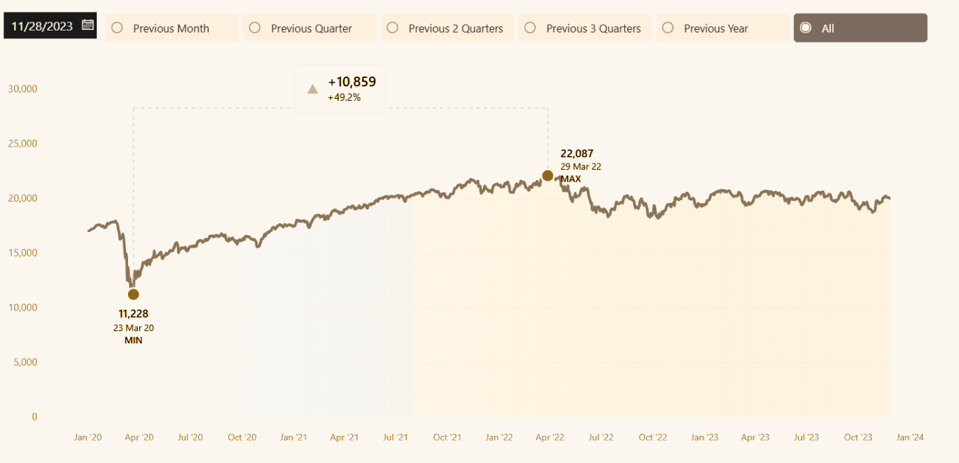
Analysis of event duration and decomposition | Single Visual
Sales by Date by Channel
16 — Sunburst
Two levels of hierarchy radiate from a central total: parents on the inner ring, their children on the outer. The ring geometry is dynamic, so the chart absorbs a changing number of categories.
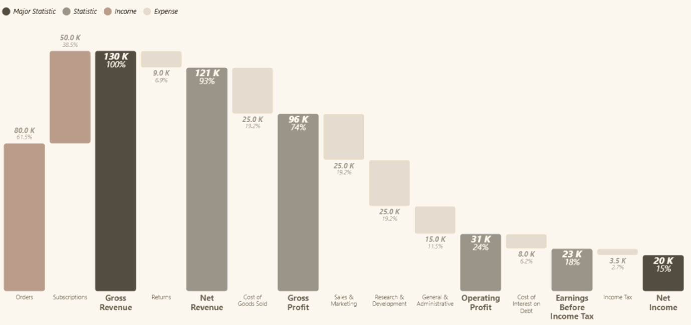
15 — Financial waterfall
A top-down bridge walks from gross revenue through each cost line to net profit, stopping at EBITDA, depreciation and tax on the way. Every step is anchored and labelled.
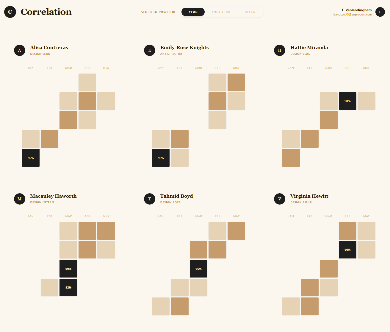
14 — Correlation chart
One panel per team member, each showing how much of their project time went to every colleague, month by month. Only pairs above 70% are drawn, in three colour bands, and the strongest pair in a panel is picked out dark and labelled with its number. Every calculation runs in Vega-Lite; there is no DAX behind it.
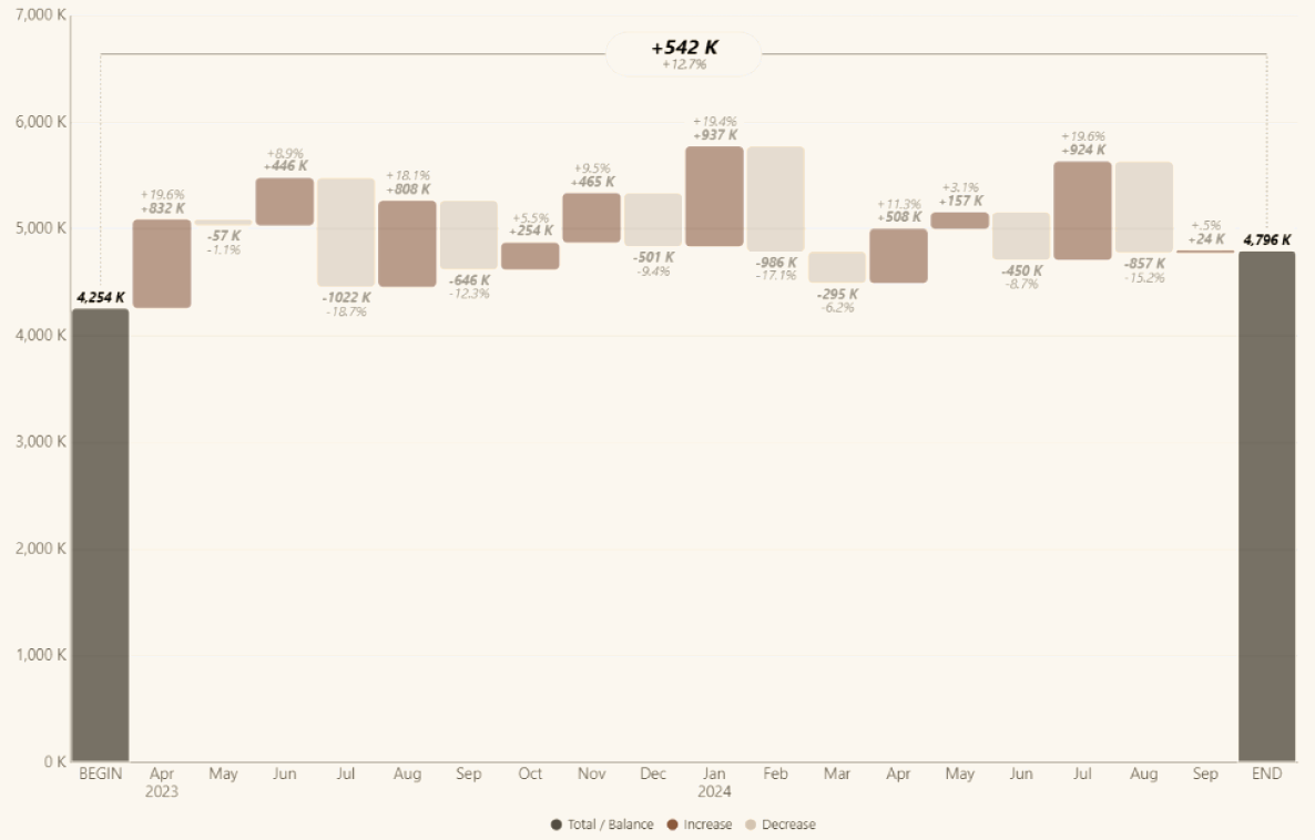
13 — Waterfall
Floating bars show what each category adds to or takes from a running total. Built for budget-to-actual and income statement breakdowns, with the period variance carried on the same axis.
12 — Area min/max
A shaded band stretches between the daily minimum and maximum, with the mean line running through it. Volatility reads as the width of the band and trend as its drift.
11 — IBCS chart
Three stacked panels in IBCS notation: variance % as lollipop dots, variance amount as signed bars with triangle markers, and actuals against prior year as grouped columns.
10 — Variance analysis
Amount variance and percent variance sit side by side. Arrows anchor on the actual value and point left or right for direction; diverging percent bars on the right carry the relative size.
09 — Regression
Scatter points with an ordinary-least-squares fit and its R² annotated on the plot. The trend and how much to trust it arrive together.
08 — Violin + box plot
The violin traces the density of every observation, and the box plot inside it anchors the median, the quartiles and the whiskers. You see the shape of the distribution rather than a summary of it.
07 — Quadrant chart
A BCG-style scatter you can filter one quadrant at a time. Isolate a segment and its points spread out to fill the frame, rather than crowding into a corner of the full plot.
06 — 2-level column
Category columns sit behind clustered sub-category columns, each carrying its own data label. The whole and its parts share one axis instead of two charts.
05 — Linear gauges
The native Power BI gauge spends most of its area on whitespace. These read the same measure against banded performance zones in a fraction of the height, with a slim pointer marking where you land. Three variants ship.
04 — Ring chart
Three concentric rings, each one measure against 100%. Stacking donut charts in Power BI means keeping their sizes, colours and alignment in step by hand; one multi-layer Vega-Lite spec does it for you.
03 — Heat map
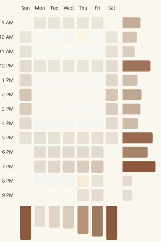
Sales by hour and weekday read as one matrix, framed by marginal bar and column charts that total each axis. Vega-Lite composes the three into a single visual, so the alignment holds without you maintaining it.
02 — Bullet chart
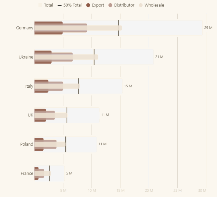
Actuals, target, benchmark and qualitative performance bands, all inside one compact bar. Useful where a dashboard has room for a single row and still needs the context.
01 — Space-saving bar
Full-width bars rank your strongest categories; everything past the cut folds into a single Others bar. Drag the slider to choose how many stay in focus.
Yours to bend
Customize freely. Every Config and Named Style is documented and waiting for your fields, your palette, your report.