September 17, 2025 · Alex Badiu
Documenting Visual Calculations using PBIR
Power BI Visual Calculations represent an important shift in how we approach analytics within reports. While they offer incredible simplicity and performance benefits, they introduce a new challenge: visibility and documentation. Unlike traditional DAX measures that appear in model metadata, Visual Calculations are hidden within individual visuals, making them difficult to inventory, understand, and maintain at scale.
In this post, I’ll show you how to leverage PBIR JSON files and AI assistance to automatically extract and document Visual Calculations, plus share important insights about their strategic value for pro Power BI developers.
You must first enable PBIR in Power BI Desktop preview features: go to File > Options and settings > Options > Preview features and check the box next to “Store reports using enhanced metadata format (PBIR)”.
What are Visual Calculations?
Visual calculations are basically calculations that live inside your charts instead of in your data model.
Traditional way: You create a measure in your model, then use it in visuals.
Visual calculations way: You create the calculation directly in the visual itself and cannot use it in other visuals.
When were they added?
- February 2024: Released as preview feature
- September 2024: Enabled by default (no longer needs preview activation)
- Still evolving: Microsoft continues adding new features
What’s the added value?
1. Simplicity
// Traditional measure (complex)
Running Total =
CALCULATE(
    SUM(Sales[Amount]),
    FILTER(
        ALLSELECTED(Date),
        Date[Date] <= MAX(Date[Date])
    )
)

// Visual calculation (simple)
Running Total = RUNNINGSUM([Sales Amount])
2. Performance
- Faster: Works on already-summarized data
- Lighter: Doesn’t add weight to your model
- Efficient: No complex filter context to resolve
3. Context-aware
- Automatically adapts to whatever data is in your visual
- No need to worry about complex DAX filter contexts
- “What you see is what you calculate”
Why should pro PBI developers use them?
❌ Common Misconception
“Visual calculations are just for beginners who can’t write DAX”
1. Great flexibility and potential better performance
2. Cleaner model design
3. Templating opportunities
One of the most exciting aspects of Visual Calculation is that, with PBIR format, you can create reusable visual templates with pre-built calculations. Thanks to Injae Park’s innovative approach, we can see how visual calculations can be templated around a single “Value” measure, making them incredibly reusable.
[!IMPORTANT] That means that you could build potentially a whole library of fully personalized visuals that you could reuse in new reports and increase your development velocity.

The documentation challenge
Here’s the problem: Visual Calculations are not like DAX measures.
They:
- Don’t appear in INFO.MEASURES
- Aren’t easily identified without clicking on specific visuals
- Are well hidden and can quickly become a nightmare to document and maintain
- Have no built-in description field
It is an important blind spot as in enterprise environments, undocumented Visual Calculations can become technical debt that’s difficult to track and maintain.
My documentation workflow
For this demonstration, I used an excellent waterfall Visual Calculation inspired by Fowmy Abdulmuttalib’s LinkedIn post and Injae’s video walkthrough.
I chose this Visual Calculations because I think it offers several key benefits over traditional tabular financial statements like:
-
Enhanced pattern recognition & flow understanding: The horizontal bar chart format makes it immediately obvious which revenues are largest and which expense categories consume the most resources. Also, the layout naturally guides the eye (Gestalt principle of Continuity).
-
Intuitive performance comparison: The side-by-side prior year and current year columns with delta indicators allow quick year over year performance assessment. The colors coding provides instant visual feedback.
-
Improved communication: This format makes financial information accessible to non-financial stakeholders who might struggle with traditional financial statements
Finally, I find very attractive the combination of numeric precision with visual clarity to make financial information more actionable and digestible.
Here is a procedure that can be used to document Visual Calculations:
Step 1: Save your report in PBIP Format
After creating your Visual Calculations in Power BI Desktop, save the report as a PBIP file in a dedicated folder.
Step 2: Identify visuals with Visual Calculations
One of the first steps is to identify which visuals contain visual calculations, so you know which ones require documentation of their underlying formulas and logic.
Using Visual Studio Code, add the entire report to your chat context and use this prompt:
Scan all pages and identify which visuals contain visual calculationsThis gives you a complete inventory across your entire report.
As a best practice, it’s highly recommended that you familiarize yourself with the various properties available to you.
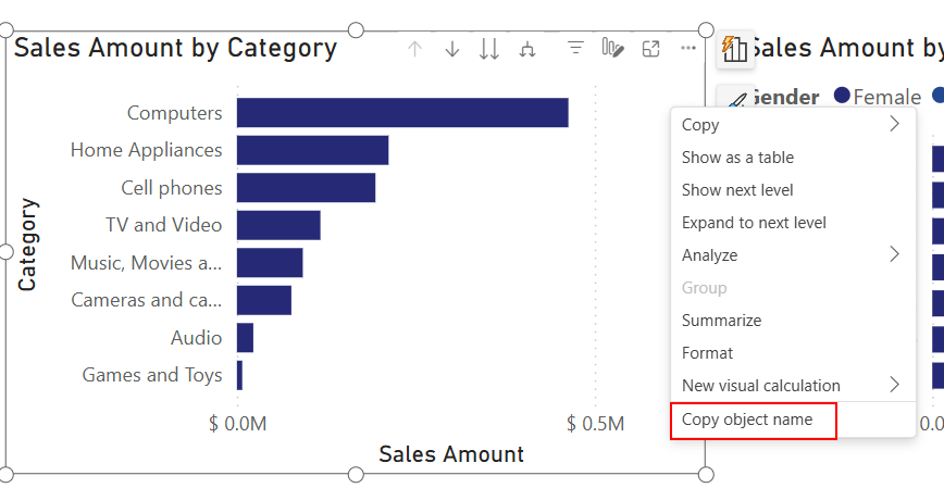
Tip Quick method to identify the technical name of a visual when creating documentation.
Go to File > Options and settings > Report settings > Report objects and enable the Copy object names when right clicking on report objects setting. This only needs to be done once.
Right click on any report object and select Copy object name.
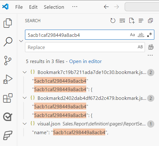
With the object name copied to your clipboard, you can easily enter it into the search bar of Windows Explorer or Visual Studio Code to locate or identify the object name within the PBIR folder.
Step 3: Document individual visuals
For each visual containing Visual Calculations, add the specific visual JSON file to your chat context and use this comprehensive prompt:
Analyze the Power BI Report (PBIR) JSON file and provide documentation in this concise format:
Visual Overview

Visual Type: [visualType from JSON]
Visual Name: [name from JSON]

Visual Calculations

For each NativeVisualCalculation found, document:
[Calculation Name]
Formula:
dax[Formatted DAX code with line breaks and comments]

Description: [Brief explanation of what this calculation does]

Measure References: [List any measures referenced like [CY], [PY], etc.]

Conditional Formatting: [Any fontColor or other formatting applied - Yes/No and details]

Hidden: [true/false based on hidden property]

Column Alignment: [Left/Right/Center/Auto from columnFormatting]

Instructions:

Extract visualType and name from the root level
Extract visual title from visualContainerObjects.title.properties.text if it exists
Find all NativeVisualCalculation entries in the query projections
Format DAX code with proper indentation and brief inline comments
List referenced measures in square brackets [MeasureName]
Check objects.values for conditional formatting rules matching each calculation
Check for hidden: true property
Extract alignment from objects.columnFormatting matching the calculation's metadata
Keep descriptions to 1-2 sentences maximum

Provide clean, scannable output focusing on the essential technical details.

Make sure to format the formulas
AI Generated documentation based on prompt
Visual Overview
Visual Type: pivotTable
Visual Name: a945e79d30de01db7cd6
Visual Title: MyName
Visual Calculations
Waterfall
Formula:
VAR _A = ABS([CY]) / 15
// Calculate scaled absolute value of CY

VAR _B = ABS(RUNNINGSUM([CY]) - [CY]) / 15
// Calculate scaled difference between running sum and CY

VAR _C = IF([CY] > 0, _B, ABS(RUNNINGSUM([CY])) / 15)
// Choose _B if CY positive, else scaled running sum

VAR _D =
    SWITCH(
        TRUE(),
        ISINSCOPE([Category]),
            REPT(UNICHAR(8202), _C) & REPT(UNICHAR(9608), ABS(_A)),
        ISINSCOPE([Total]),
            REPT(UNICHAR(9608), RUNNINGSUM([CY]) / 15)
    )
// Build Unicode bar for Category or Total

RETURN _D
Description:
Renders a Unicode-based waterfall bar for each Category or Total, scaled by [CY] and its running sum.
Measure References:
[CY], RUNNINGSUM([CY]), [Category], [Total]
Conditional Formatting:
Yes — fontColor by [_Measures.waterfall color]
Hidden:
false
Column Alignment:
Left
Delta
Formula:
VAR _X = [MaxCY_ByTotal_PerYear] / 100
// Scale factor based on max CY per year

RETURN
IF(
    [Delta△] < 0 && ISINSCOPE([Category]) && _X <> 0,
    REPT(UNICHAR(9473), INT(ABS([Delta△] / _X))),
    BLANK()
)
// Render bar for negative Delta△ values
Description:
Displays a horizontal bar for negative [Delta△] values per Category, scaled by [MaxCY_ByTotal_PerYear].
Measure References:
[MaxCY_ByTotal_PerYear], [Delta△], [Category]
Conditional Formatting:
Yes — fontColor by [_Measures.Delta color]
Hidden:
false
Column Alignment:
Auto
Bar
Formula:
VAR _X = [MaxCY_ByTotal_PerYear] / 100
// Scale factor based on max CY per year

RETURN
IF(
    [Delta△] > 0 && ISINSCOPE([Category]) && _X <> 0,
    REPT(UNICHAR(9473), INT(ABS([Delta△] / _X))),
    BLANK()
)
// Render bar for positive Delta△ values
Description:
Displays a horizontal bar for positive [Delta△] values per Category, scaled by [MaxCY_ByTotal_PerYear].
Measure References:
[MaxCY_ByTotal_PerYear], [Delta△], [Category]
Conditional Formatting:
Yes — fontColor by [_Measures.Delta color]
Hidden:
false
Column Alignment:
Left
- Et voilà! Technical documentation automated and done. How cool is that?
Best Practices for Visual Calculations
1. Use meaningful names
Instead of “Calculation1”, use descriptive names like:
Render_Bar_WaterfallCalculate_RunningTotalPercentCalculate_Rank_ByCategory
2. Add Comments in Your DAX
Visual Calculations don’t have description fields, so inline comments become crucial:
VAR _ScaleFactor = [MaxValue] / 100  // Scale bars to fit column width
VAR _BarLength = INT([Value] / _ScaleFactor)  // Calculate bar length
RETURN REPT(UNICHAR(9608), _BarLength)  // Render Unicode bar
3. Follow consistent naming conventions
- Prefix by purpose:
Bar_,Rank_,Pct_ - Use descriptive verbs:
Calculate,Render,Format - Include units when relevant:
Days,Percent,Currency
4. Document dependencies
Always list which measures your Visual Calculations depend on. This helps with:
- Impact analysis when changing model measures
- Troubleshooting calculation errors
- Understanding data lineage
Enterprise considerations
The missing context problem
The current AI-generated documentation is tactically sound but strategically incomplete - For enterprise environments, you need context beyond technical specifications.
What’s missing from automated documentation:
- Business purpose: Why this visual exists and why Visual Calculations were chosen over traditional DAX
- Performance profile: Expected data volumes and refresh times
- Maintenance guidelines: Who can modify these and under what conditions
- Author information: Who created this and when
- Dependencies: Which model changes would/could break these calculations
My recommendation: Hybrid documentation
Create a separate documentation for context (Excel spreadsheet, markdown file, etc.) where you manually add:
- Business justification for each Visual Calculation
- Performance benchmarks and expectations
- Change management guidelines
- Author and creation date information
- Links to requirements or user stories
Alternative approach: Embedded code comments If maintaining separate documentation isn’t viable for your team, consider adding comprehensive comments directly within each Visual Calculation formula. This approach ensures documentation travels with the code and remains visible to anyone reviewing or maintaining the Visual Calculations, though it does add some overhead to the calculation definitions. I think this approach is very useful up to a certain documentation threshold.
Idea: I wish Microsoft would introduce a description box for every visual element, bookmark, and feature in general. It should not be mandatory, but stored as a specific attribute within the PBIR JSON structure.
For organizations with multiple reports, you can also consider creating a **Visual Calculation inventory**:
| Report Name | Page | Visual Name | Calculation Name | Formula Preview | Dependencies | Last Updated |
|---|---|---|---|---|---|---|
| Sales Dashboard | Overview | Sales Trend | Running Total | RUNNINGSUM([Sales]) | [Sales] | 2024-01-15 |
| Finance Report | P&L | Variance Chart | Waterfall Bar | REPT(UNICHAR…) | [CY], [PY] | 2024-01-20 |
This inventory helps with:
- Impact analysis when model changes occur
- Code review processes for Visual Calculations
- Knowledge transfer when team members change
- Performance optimization across reports
Key Takeaways
- Visual Calculations are still in preview but have a lot of potential
- Documentation is critical: They’re hidden by design, making documentation essential
- AI can automate the technical extraction: but human context is still required
- Naming and commenting matter more: no built-in description fields means inline documentation is crucial
- Hybrid documentation works best: combine automated extraction with manual context
Conclusion
Visual Calculations represent a significant evolution in Power BI development, offering performance and simplicity benefits that even advanced developers should embrace. However, their hidden nature creates new challenges for documentation and maintenance.
The AI-powered extraction approach I’ve shared automates the technical documentation to an unprecedented level, giving you complete visibility into Visual Calculations across your reports. But remember: automation provides the foundation, not the finish line.
The strategic value comes from adding business context that only human insight can provide. Use the automated extraction as your technical skeleton, then add the operational context that makes it valuable for enterprise use.
As Visual Calculations continue to evolve and become more prevalent in Power BI reports, having robust documentation practices will become increasingly important. Start building these practices now, and your future self, and your team, will thank you.
Have you started using Visual Calculations in your Power BI reports? What documentation challenges have you encountered? I’d love to hear about your experiences and any improvements to the approach I’ve shared.